2014: A Year of Progress in How Newsrooms Worked With Data
,With every new trend, interest goes up and down. Only strong trends keep developing and reach new levels of productivity–as generally described in the Gartner Hypecycle. One such trend is „data-driven journalism". The term became very much talked about over the last years since its appearance in 2010, describing workflows for finding, checking and visualizing data for better reporting.
As this is early 2015 the question is what progress did this specialized form of journalism make in 2014?
While many successful businesses (i.e. Google) almost entirely rely on number crunching and other big companies have always been analysing their data in order to steer production, sales and profitability , newsrooms have always been a step behind.
Data-driven journalism (#ddj on Twitter) is now a way for media companies to catch up. The „umbrella term" is not just about visually appealing analysis, essentially there are two drivers of change:
- Visualizing the connections or the developments over time, which makes it possible to compare situations. It's all about using data as a „new point of view" in an increasingly connected world. New visualization libraries have created many new options to do that. These libraries (most notably D3.js) are often free to use.
- New workflows in the newsrooms, to have data available in order to understand trends. In the past newsrooms would start the day doing research and publishing and would often simply start the same process again the next day–seldomly reusing information stored in databases.
So, in review of 2014, are there any outstanding examples of what is possible today?
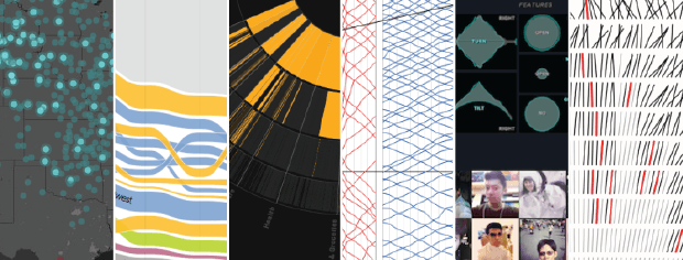
What we are currently seeing is that some organizations like the New York Times, The Guardian, The Economist, The Washington Post to name but a few of the top players have set-up dedicated data desks and teams of journalists, coders and designers to use the power of data and visualization. Furthermore, there are a number of single data visualization creators pushing the state-of-the-art forward, one dataset at a time.
Here are some of the best and most telling aggregations of data-driven journalism highlights in 2014 we thoroughly recommend:
- Ten significant Visualization Developments, July to December 2014
Andy Kirk, from Visualising Data, has put together an impressive collection of ddj & dataviz examples. What we love about his list, is that it covers a wide range of projects and examples, big and small, from teams or single creators, and different topics. It's worth checking it out. - Flowing Data: The best Data Visualization projects of 2014
Another great commented list of data projects in 2014 can be found on „Flowing Data", edited by Nathan Yau. He focuses mainly on data visualization projects–but that doesn't make it less interesting. - New York Times: 2014 The Year in Interactive Storytelling
With one of the largest (and most experienced) teams for multimedia stories and data visualization the New York Times can publish an impressive range of projects just by itself. What we like a lot about this is the immersive style of storytelling in here. - The Washington Post Graphics Blog
An equally interesting list of visualizations, text analytics, infographics and timelines can be found on a dedicated Tumblr, run by the graphics team of the Washington Post. We really like the idea of having a separate blog about their work, because you can easily browse through their works, easily comment on single pieces of work and quickly share them with others. - Dadaviz
If you want to get a daily dose of visualization examples from around the world and multiple sources, the Dadaviz feed is a good destination. Scroll down the page to see examples, from complex to simply effective on daily basis, covering a wide variety of topics.
Do you have other examples from 2014 or in general that you consider worth sharing? Tell us and let us know why!