How We Made Data Evaluation More Fun
,Our participation in EU projects often gets us involved in the dissemination and evaluation of the projects' results. Using the example of Social Sensor , this article explains how we used an iPad app to support us in both tasks.
In-depth evaluations do not scale
Typically, a system developed in our EU projects is tested via a series of in-depth evaluations. An instructor guides individual users through the system and asks them specific questions related to the user experience, recording the results into a form. A statistician subsequently summarises the results in a (usually) semi-automated way.
And the more people test the system, the more labour is involved.
Consequently, while in-depth evaluations are well suited to collect detailed feedback on User Interface and User Experience, they are less suited where a large number of measurements are required–for example when it comes to assess the efficiency of a particular algorithm.
So we thought of a way to test suitable system features in a less labour-intensive, more playful way, aiming to reach more testers, while requiring less of their time. And we applied this idea to the Social Sensor project.
The Social Sensor EU Project
Social Sensor is an FP7 project where 11 partner organizations, Deutsche Welle being one of them, contributed to the development of a platform capable of analyzing Social Media streams in realtime. One of the aims was to extract "hot" topics (in Social Sensor lingo, topics are also called DySCOs, short for Dynamic Social Container Object) as quickly as possible, thus giving journalists–once a relevant topic was identified–initial material to start writing a story.
Taking the playful approach
When it came to evaluating the algorithms invented for Social Sensor, we used the playful approach outlined above. We asked the following questions:
- Could we test one aspect of the system where the effort would not linearly increase with the number of testers?
- Could we give that app a light-weight touch, ideally so that it could be used casually, without taking too much of people's time?
- And could the app still yield useful results, ideally without the testers considering their interaction with the app to be hard work?
We concluded that the development of an iPad app would be the answer to these questions. Have a look at the video below for a first explanation of the app.
The iPad app itself
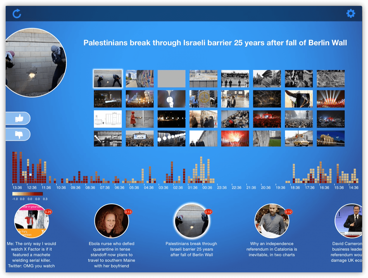
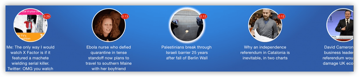
The bottom row contains a series of image circles, representing hot social media topics that the Social Sensor platform recently identified:
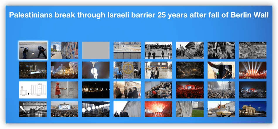
Once a topic is selected, a grid of associated images, as well as the topic’s title, is displayed in the top-right quadrant:
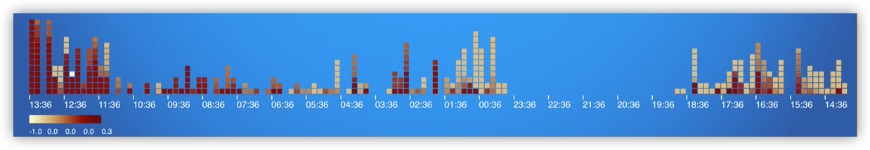
The app also features a visualisation illustrating the system activity over the last 24 hours. Arranged from left (current time) to right (24h ago), each of the depicted columns represents a 10-minute time slot. Each column in turn consists of small coloured squares, where each square represents a detected topic. Red squares correspond to hot topics, i.e., topics that are rated as highly relevant by the system. Similarly, lower-ranked topics are shown in increasingly paler shades of red.
Finally, the app features two buttons – thumbs up and thumbs down. With these voting buttons, app users (in this case professional journalists) have the option to indicate whether they think that the currently selected topic is relevant to their work – or not.
The evaluation
Once a topic is voted upon, the vote is registered via a simple API on the Social Sensor platform alongside the topic's position (i.e., the ranking) inside the topic row. The system stores the information in a mongoDB database, where it can be queried via the same REST API.
And here is where the beauty of this approach lies: a simple Python script is capable of accessing the API via HTTP requests, retrieve the relevant data and produce a summary–in our case a text with comma-separated values (CSV). And this evaluation can be re-run at any time–updated results are only a script execution and a few 100 milliseconds away!
The results
We then used gnuplot to visualise the result:
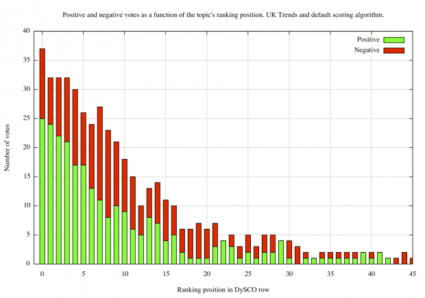
On the x-axis, the graph shows the topic position–topic 0 (the left column) is the most highly ranked topic while less relevant topics (with higher position numbers) are positioned further to the right. On the y-axis, the number of positive (green) votes and negative (red) votes are shown as a stacked bar.
The graph demonstrates that
- in most cases, users were content to inspect the first 10--15 topics
- users never progressed beyond the 45th presented topic
- the system presented a roughly equal share of relevant and irrelevant topics
But how effective is the ranking algorithm? Does it really manage to present the most relevant topics first? To examine this particular question, we added a few lines to our script to calculate, for each topic, the share (in percent) of positive votes with respect to all votes.
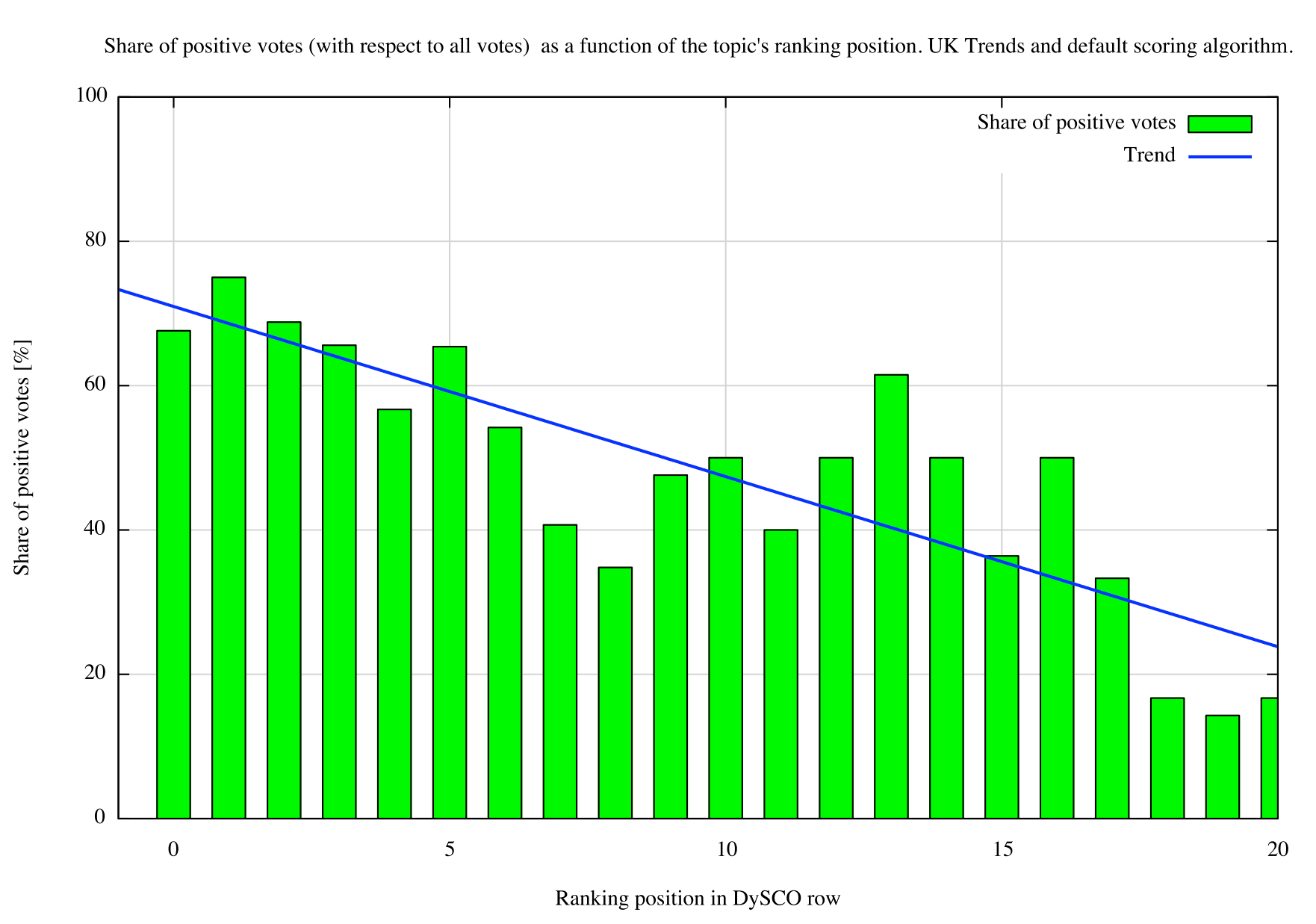
If we restrict the display to the 20 most highly ranked topics, we find that topics with a higher ranking scores (towards the left) tend to be more relevant (60%--80% of positive votes) than topics with lower ranking scores (towards the right, 0%--20% of positive votes). The blue trending line was fitted to the data and illustrates this observation.
Summary
While in-depth evaluations via one-to-one interviews still play an important part in our evaluation strategy, we found the idea to automate the evaluation of certain system aspects to be a huge time saver. While the evaluation report was written, the graphs could be updated with very little effort, thus making sure that the maximum number of user votes could be included. Once everything was set up, it sufficed to run two scripts on the command line and the graphs were updated.
The history visualisation gave us a valuable insight into the system's activity, showing us at what time of day hot topics tended to appear.
And finally, we gave our testers a tool that they could use at their leisure, sometimes only a few minutes at a time, making the evaluation task an enjoyable one.
If you want to learn more about the Social Sensor project please visit their website.