More Than Boring Numbers: Data Journalism on Social Media
,How might we best tell data-driven stories on social media? DW and the European Data Journalism Network (EDJNET) want to experiment with different approaches. A guest post by Kira Schacht and Gianna-Carina Grün.
When we as a data team finally publish a long-term data-driven investigation, we are super happy we made it across the finish line, but exhausted at the same time.
We usually talk to our social media colleagues a few days ahead of publication. However, both ends often lack time and energy to come up with really creative ideas on how to best promote the story on social media. So our usual strategy is to either post a preview link (which indicates the special type of content via a preview image) – or to upload key charts from the article along with a URL:
It seems that most other media companies haven't found a way to make DDJ stories stand out either. Sometimes, you see screencast videos or animated GIFs, (that don't tell a story in itself, but rather work as teasers), sometimes you see graphics explainer videos. But there doesn't seem to be a proper set of guidelines or rules on showcasing data stories on social media.
Our goal: Developing format ideas and guidelines
As partners in the EDJNet, our overall goal is to come up with reusable and sustainable formats/rules for better data-driven storytelling on social media. We want to find at least one for each for the following platforms: Facebook, Instagram, Twitter, and YouTube.
Before starting to experiment with own format ideas, we decided to compile an overview of how different media companies present data-driven content on social media, and how this content performs in comparison to non-data-driven posts.
Our first insight: There hasn't been much comprehensive research so far, rather individual examples where media companies like The Economist share their experiences.
How are other media companies doing it?
To get a fuller picture, we set out to monitor Axios, BBC News, BuzzFeed News, and Vox.Com for two weeks (or at least 20 post), looking at all platforms the respective media company would publish on. We also interviewed some data team members.
Here's a quick summary of what we learned:
Classification
Deciding what qualifies as data-driven content and what doesn't can be a difficult distinction to make. We decided to establish three categories:
- non-data-related content
- data-driven content
- journalism-with-numbers content.
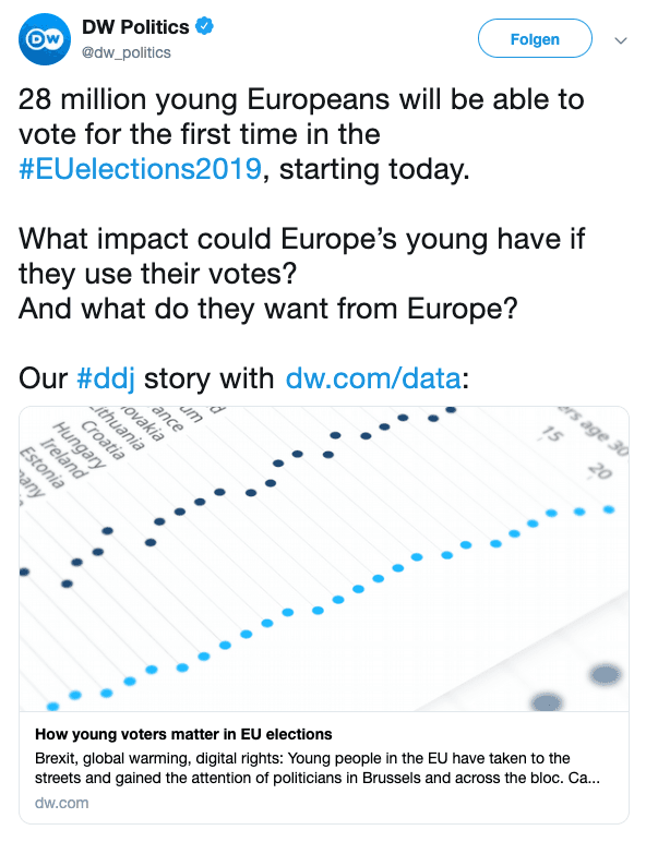
For example, we would consider this post "journalism with numbers":

There are multiple numbers cited in the post, they even serve as the hook of the story. Still, no own analysis was conducted and no data was visualized.
Prevalence
According to the labels defined above, only 7% to 18% of posts (depending on the respective platform) were data-related.
Presentation
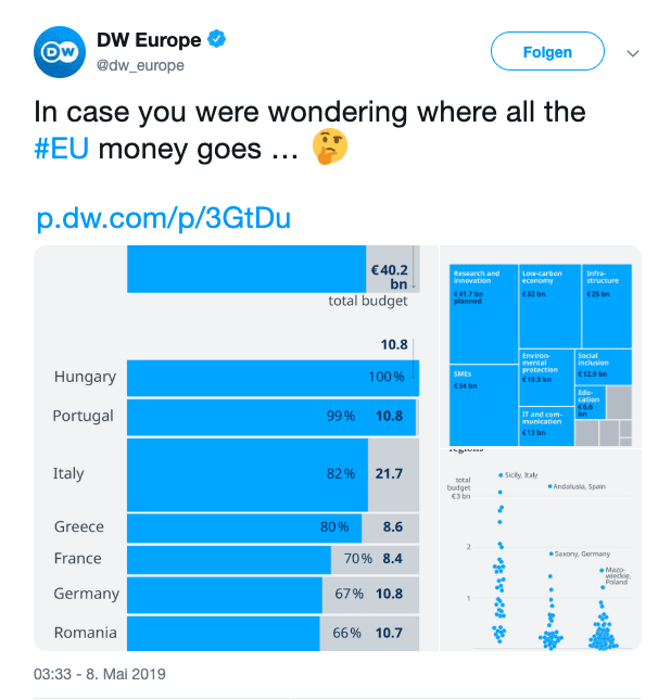
On Twitter and Facebook, most data-driven content was featured with a link preview (or a chart at best) to indicate: This content is different. Interviewees told us other formats are sometimes used as well, but we didn't find any in our sample.
Instagram is the most versatile platform: we found charts, galleries, and videos.
A typical example for posting data-driven content on Twitter is the teaser for this interactive piece on warming cities by BuzzFeed News:
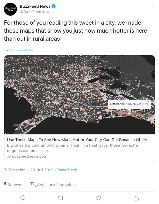
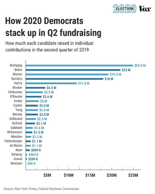
This post performed below BuzzFeed's average. Link preview posts can also be very successful, though: This post by Vox, for example, almost received a hundredfold of the median reactions.
Performance
It's hard to say whether data-driven posts are more or less successful than regular content. On Instagram, they performed slightly better, on Facebook slightly worse, on Twitter there was no difference, and on YouTube, it was only Vox who managed to achieve better results with data-related videos than with other content.
The performance seems to depend on what kind of content users expect on a certain platform, how it is presented, and–of course–on the story itself.
For example, our sample included two data-driven posts from the Vox Instagram page. One was less, one more successful than their median of 4016 likes.
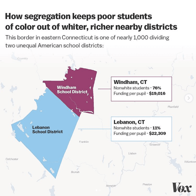
The first post, which performed under average, is quite complex. The text is small, and the findings probably aren't stated clearly enough.
The second post, on the other hand, has a much clearer message and, arguably, a more compelling visual style. It also uses more Instagram features to effectively tell its story. Vox actually chose to post a gallery of two images: The first one featured the easy-to-access map pictured here, the second one provided a more complicated chart with further information.
Plan of action
Confirming our original assumptions, interviews also revealed that the data teams themselves usually don't develop particular strategies. They instead rely on their social teams to find solutions for sharing DDJ content on Facebook, Twitter, Instagram, or YouTube. The quality of the outcome depends on how well teams are integrated and able to cooperate in the respective newsrooms.
If you're interested in more details, check out our full report on GitHub.
What's next?
Our main take-away so far: There's still a lot to explore regarding DDJ on social media. And a lot of potential to be exploited. The next step will be to sit down with our social media colleagues and develop first concept ideas.
Here are some of the questions we want to consider along the way:
- What would an ideal workflow between social teams and data teams look like?
- How might we improve the conversion from social media to our website?
- How might we support high engagement AND good conversion at the same time?
- What would simple and sophisticated formats look like?
If you have questions or input regarding our project, don't hesitate to reach out: data-team@dw.com
Kira Schacht is a data journalist with DW Data. She carried out most of the analysis and wrote large parts of the report. Gianna-Carina Grün is the head of DW Data. She is a contributor to and the overall manager of the project for which DW (as part of EDJNET) has been indirectly funded by the European Commission.