
Data-Driven Journalism for Social Media: Creating the Right Post for Every Platform and Occasion
,How can social media be more than just an afterthought for data-driven journalism (DDJ)? As a partner of the European Data Journalism Network (EDJN), our colleagues at DW Data have been exploring ways to attract readers and make DDJ stories more interesting on Facebook, Instagram, Twitter, and YouTube. Here is a guest post with new insights by Kira Schacht.
To make DDJ more appealing and find out which approach fits which situation, we have experimented with presenting our stories on different platforms, in different formats, and with different levels of complexity:
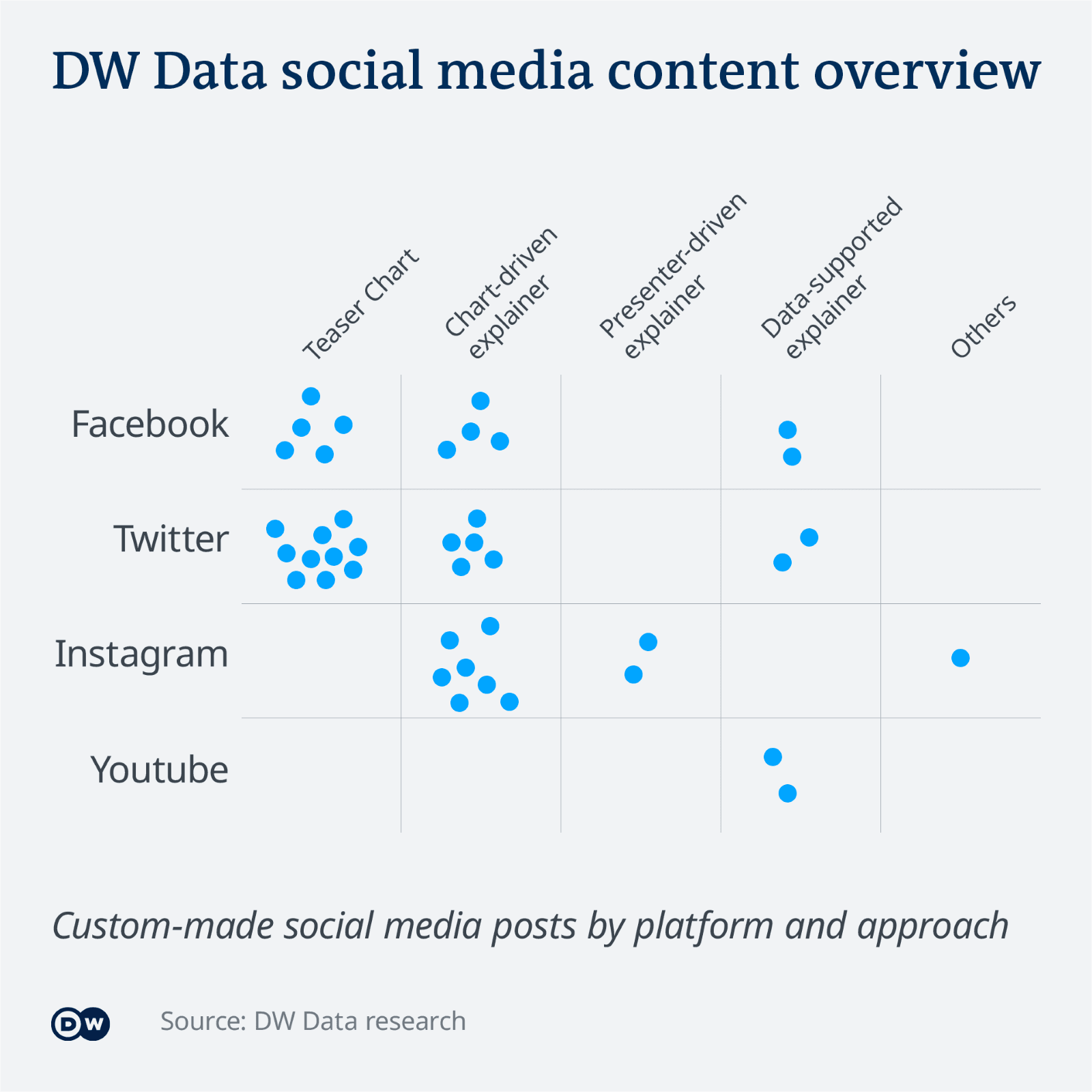
So far, we have identified four main categories that most of our posts fall into:
- Teaser charts
- Chart-driven explainers
- Presenter-driven explainers
- Data-supported explainers
Posts featuring simple links are missing here. Although they may be perfectly fine to promote your data story, our focus is on something else.
You will notice right away that most of the posts are called "explainers"–with good reason: Even news-heavy data stories tend to dig deeper into complex topics and provide broader context. That is why–especially on social media–it is almost always one of our main goals to help audiences understand a story and the reasoning behind it.
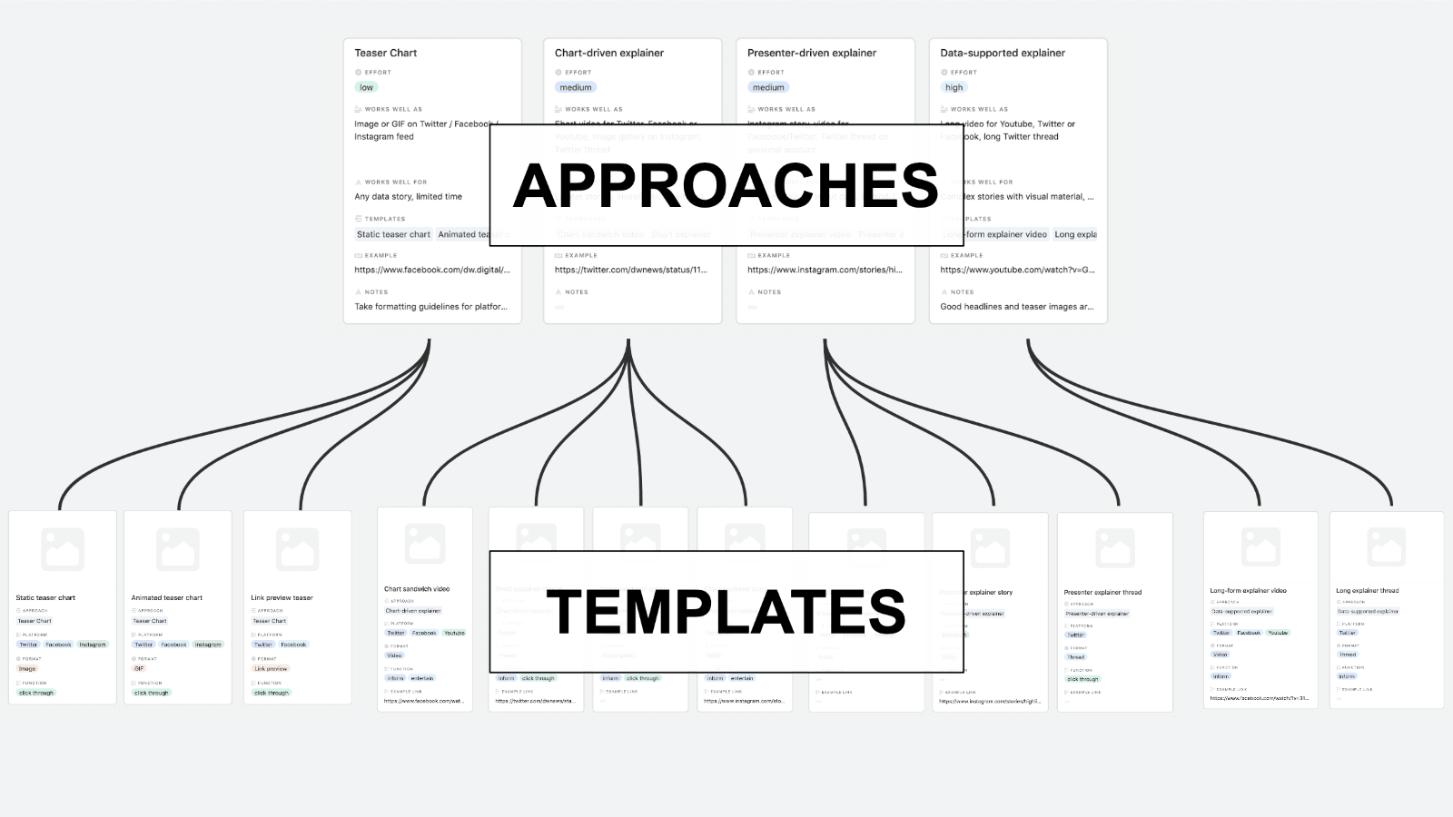
For all four approaches, we set up templates: Specific blueprints for posts, defined by formats, goals and platform optimization.
Let's take a closer look.
Teaser Charts
Effort: low
Work well as: Image or GIF on Facebook, Instagram, Twitter
Work well for: Any data story, projects on a budget and a tight deadline
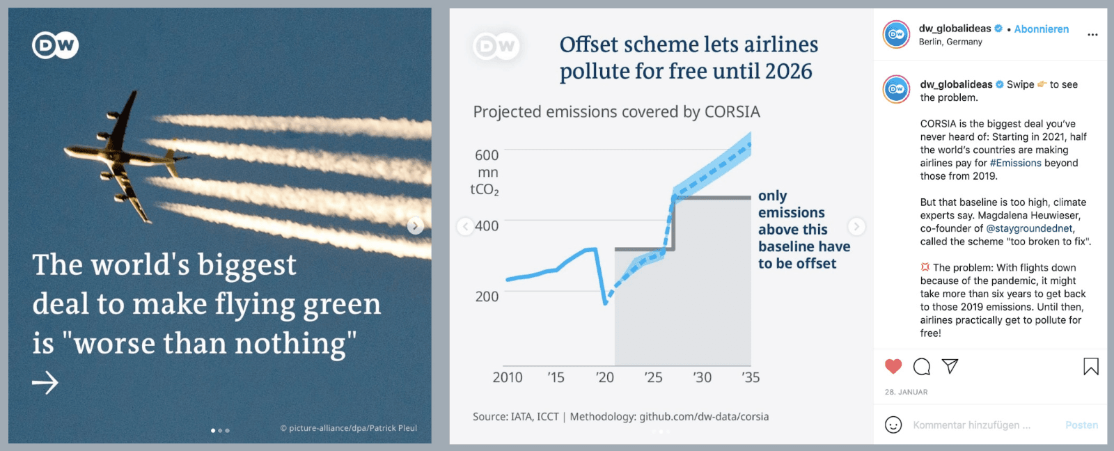
The easiest way to make a story stand out is using a teaser chart, i.e. a chart (or a collection of charts), animated or static, that is accompanied by a short description and a link to the main article.
A teaser chart should be simple enough to be legible on a mobile device and ideally adapted to the format that works best on the respective platform (e.g. the 1:1 format for Instagram) .
The goal of a teaser chart is to get users interested in reading more, and to convert their interest into traffic for an external website containing the main article. Teaser charts should showcase an interesting finding, but not give away the entire story.
Because the effort required to create these charts is relatively low, they are a good fit for any data story, especially for projects with a low budget that need to be completed in a limited amount of time.
A teaser chart can be used on Facebook, Instagram (as a feed post), or Twitter and might be static or animated, in the form of a GIF or video.

If custom graphics are too much effort, there is always the option to use the most visually impressive chart of the story as a link preview teaser image.
Templates:
- Static teaser chart (Facebook, Instagram, Twitter)
- Animated teaser chart (Facebook, Instagram, Twitter)
- Link preview teaser (Facebook, Twitter)
Chart-driven explainers
Effort: medium
Work well as: Short video for Facebook, Twitter, or Youtube, Instagram image gallery, Instagram Story, Twitter thread
Work well for: Lighter stories, investigations with less time or budget for social media
A chart-driven explainer is a versatile, short explainer post that leads through a story using one or more charts, which may be interspersed with explanations and more information on the topic. The goal of a chart-driven explainer is to quickly convey the most important points of a data-driven story.
Unlike a teaser chart, a chart-driven explainer presents most of the information directly on the social media platform. The post might still include a link to the full article, but drawing audiences to an external website is not its main intention.
There are several ways to implement a chart-driven explainer: It could, for example, come in the form of a short video for Facebook, Twitter or even an Instagram Feed post, or a Story for Instagram, Facebook or Twitter Fleets.
On Instagram, specifically, one option is a chart sandwich gallery, i.e. an image gallery that consists of:
- a title slide with the main finding, followed by
- slides with explanatory charts, and
- optional further information in the form of videos/photos.
The post description can then be used to give an overview of the story. Outlets like Axios have long made this format a staple of their Instagram strategy.
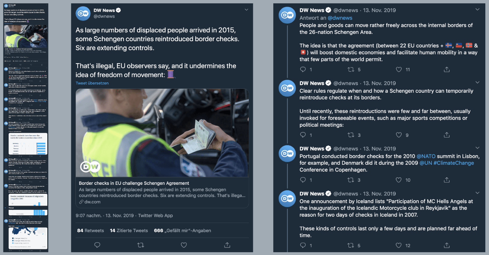
We have also had good experiences with explainer threads on Twitter. They give you the option to tag interview partners and relevant organizations and allow readers to quickly absorb the essence of a story. Explainer threads are an excellent low-budget option to explain complex topics and include charts, images and videos as needed.
It takes more time to create chart-driven explainers than teaser charts, but the amount of work is usually still manageable.
Templates:
- Chart sandwich video: Facebook, Instagram Feed/Reels, Twitter, Youtube
- Short explainer thread: Twitter
- Chart sandwich gallery: Instagram Feed
- Chart explainer story: Facebook Story, Instagram Story, Twitter Fleets
Presenter-driven explainers
Effort: medium
Work well as: Story, video for Facebook/Twitter, Twitter thread on personal account
Work well for: Meta-explainers about data, look behind-the-scenes
For especially complex topics with little visual material, or for a look behind-the-scenes at investigations, it might help to let authors present a story themselves.
This can be done either in the form of a story (Facebook, Instagram, or Twitter Fleets) or a short video. A Twitter thread on the author's own channel is also an option.
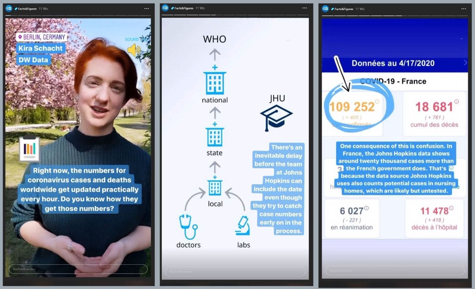
Once again, the goal is to tell the story directly on the platform. Presenter-driven explainers establish a personal connection with the audience.
Presenter-driven explainers work especially well for meta-explainers about data, e.g. when a journalist illustrates how Covid-19 case numbers are collected and passed through various organizations before they reach international dashboards.
In terms of effort required to produce them, presenter-driven explainers are (more or less) on par with chart-driven explainers.
Templates:
- Presenter explainer video: Twitter, Facebook, Instagram, Youtube
- Presenter explainer story: Instagram, Facebook, Twitter
- Presenter explainer thread: Twitter
Data-supported explainers
Effort: high
Work well as: Long video for Youtube, Twitter or Facebook
Work well for: Complex stories with visual material, bigger budget
This approach uses data and visualizations for support, even if the story itself is not data-driven. A prime example for data-supported explainers are the Vox videos on Youtube: Long-form explainers that dive into all the complexities of a story or investigation. Even when based on an online article, data-supported explainers might focus on different aspects and find their own narratives, often with a stronger focus on storytelling.
The goal is to engage with audiences directly on the social media platform.
Data-supported explainers work best for a certain type of story: They need an engaging detail or a premise that draws audiences in and makes them understand the complex inner workings of the topic.
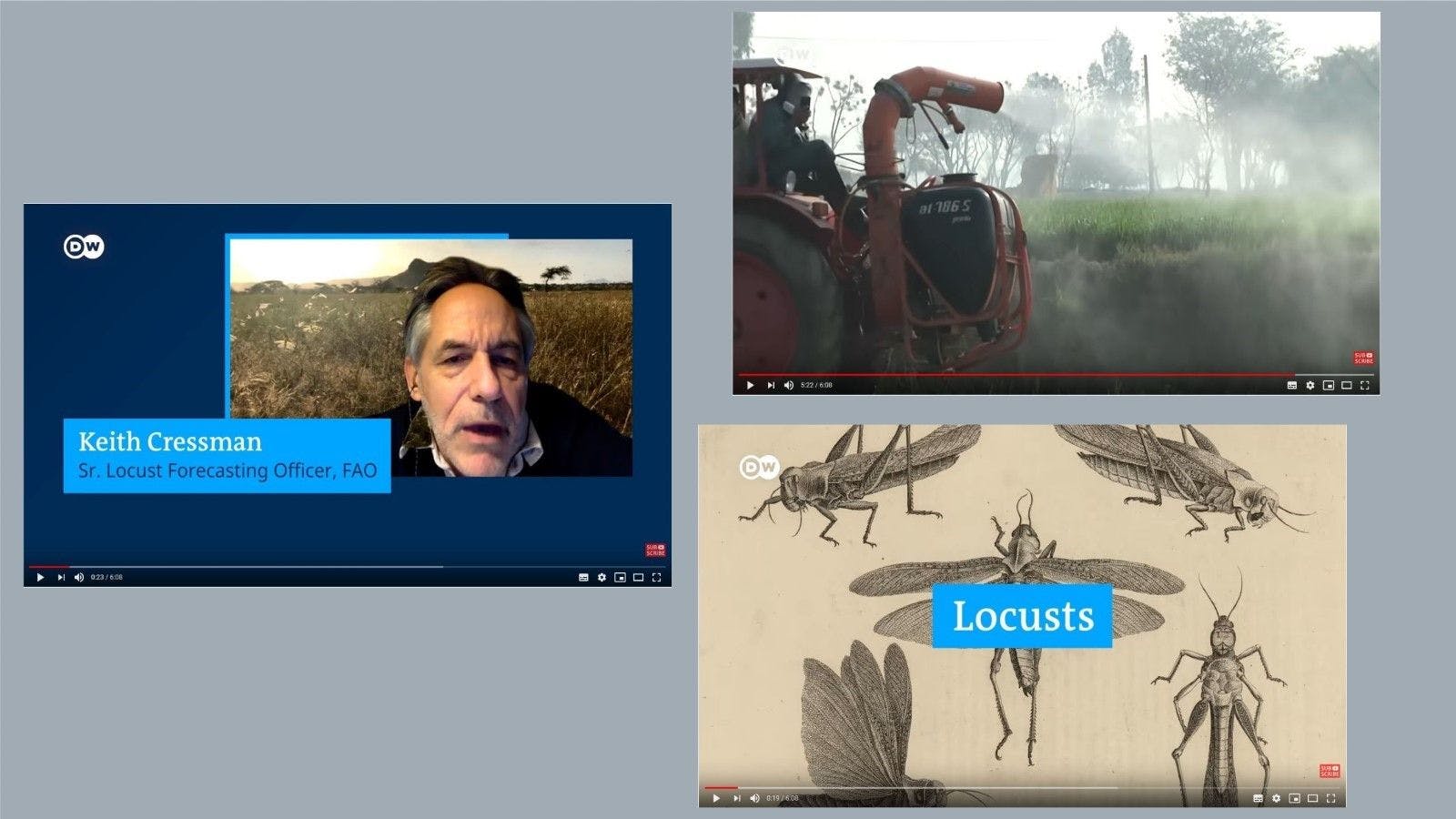
Data-supported explainers (that often come in the form of social media videos) need strong visual material to support a story beyond charts and graphs. If there is not enough material, animations can be an option. With enough depth and substance, an explainer thread on Twitter might also fall in this category.
In general, data-supported explainers require the most time, effort and money to produce.
Expenditure and costs can be worth it, though: Data-supported explainers have the power to connect new audiences with complex stories and investigations.
Templates:
- Long-form explainer video: Facebook, Twitter, Youtube
- Long explainer thread: Twitter
Contribute to our DDJ social media matrix
This attempt at categorizing data-driven social media posts is informed by the specific focus of Deutsche Welle and EDJNet. There are definitely more approaches (and templates) to be found in the wild, and we're happy to integrate them into our system.
If you have any suggestions, please write to:
Related posts
Would you like to learn more about DDJ on social media? Check out our previous posts on the subject: